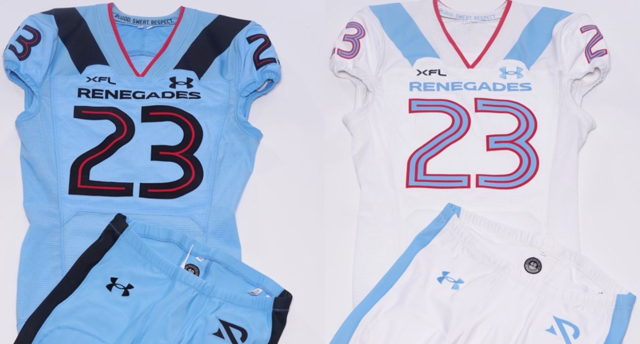
The XFL’s Arlington Renegades have introduced their new uniforms for the 2023 season set to begin in February.
Under Armour partnered with the XFL to produce unique uniforms for each of the league’s eight teams ahead of the reboot season.
Additionally, the Renegades debuted a new logo, a simple “R,” with the leg of the letter cutting across the remainder of the letter.
The Renegades describe the logo as paying respect to the angled slash design used by rebellious groups throughout the history of the state of Texas.
Previously, the Dallas Renegades of the 2020 XFL used a logo that was of a bandit wearing a cowboy hat and a face mask in the team colors that vaguely resembled the shape of the state of Texas.
The newly-released uniforms for the Arlington Renegades do away with the former dark blue, black, and light blue uniforms worn by the former Dallas Renegades of the 2020 XFL.
A light blue color called “Arlington Blue” is the predominant color of the new home uniforms, which also feature a single dark slash on both shoulders.
The home jerseys have a dark number striped in deep red to make it easier for fans to identify the players. Home pants will match the jersey, and players’ names will be in the traditional location.
Team numbers will also be on the shoulders, and the Renegades’ name will be just above the numbers on the front of the jersey.
Away uniforms will be a solid white design with light blue details, including the shoulder slashes, numbers, and the Renegades logo on the front. The pants will match the jersey for the away uniforms, like the home uniforms.
The helmet will be a predominantly light blue color with a gradient stripe down the center that fades from front to back. The face mask is black, and the stylized “R” logo will be on both sides.
Numerous small details are part of the league’s new uniforms.
The front of uniforms will include the silhouette of a bull’s head to pay homage to Project Rock, a foundation started by XFL co-owner Dwayne “the Rock” Johnson. Inside the neckline, all uniforms will feature the league mantra that reads “Blood. Sweat. Respect.”
Under Armour is crafting the XFL uniforms using a variety of textiles to enhance performance and provide durability. The material for the bulk of the uniform will be the company’s proprietary ArmourGrid 2 material.
The front and back of the uniform feature a ventilated material the company calls ArmourGrid Vent that features a ripstop “no grab” texture.
Shoulders, cuffs, and collars are made from Twillot, and Smokestack Vent material is used on the sides and lower panels.
“We have built an incredibly strong relationship with Under Armour over the years as our trusted partner with Project Rock,” said XFL Owner Dwayne Johnson.
“We have become industry leaders in game-changing, innovative products, specifically designed and tested for premium performance, which made them the perfect partners for our XFL brand,” Johnson continued.
“For almost two years now, we have been working closely with Under Armour to ensure these new uniforms not only represent the pride and history of each city but are also designed to withstand the physicality of this sport and each player leaving it all on the field come game day,” Johnson added.
“Now it’s time for our players to gear up and ball out XFL style for the 2023 season,” he concluded.
The new design is kind of weak. The light blue color is great, but doesn’t have a lot of weight. It is best used as a secondary color, ( Tennessee Titans, Carolina Panthers, Houston Oilers ). It needs more black to give the overall look some strength. I like the Red as an accent color, but needs to be limited – more is less. I like the new simplified, graphic logo. It could use an outline, or a possible tilt,(italicization) to give it some urgency. A little tweaking of your existing logo could read as an”A” and an “R” simultaneously. And just a suggestion; keep the old logo as a shoulder patch, and accent the outline of the State so it reads clearly Texas,(something Houston and SanAntonio don’t have). I don’t care for the font used for the numbers. The numbers look like a soccer jersey, not a Texas Football Team.
You have all of the elements of a unique and classic Team Identity, but seems like it’s not quite there yet. Pardon the expression, but it has no balls in it’s current form. I would hold off on sending the Artwork to the printer, and postpone the press conference roll out.
A great design will guarantee a high level of apparel sales, which is a key generator of profits for a new organization. I hope you will consider these positive criticisms. I am a Designer and a big Football fan who would definitely wear a Renegades Jersey if I really liked the design. Your current Team Identity leaves me wanting a lot more.