
Texas Tech Athletics has announced a rebrand, introducing a modernized “flat T” logo set to debut in the 2026-27 academic year, provoking an outpouring of mixed opinions.
The new design, a departure from the metallic Double T used since 2000, draws inspiration from the university’s logo from 1963 to 1999, a period marked by 13 bowl game appearances and a women’s basketball national championship.
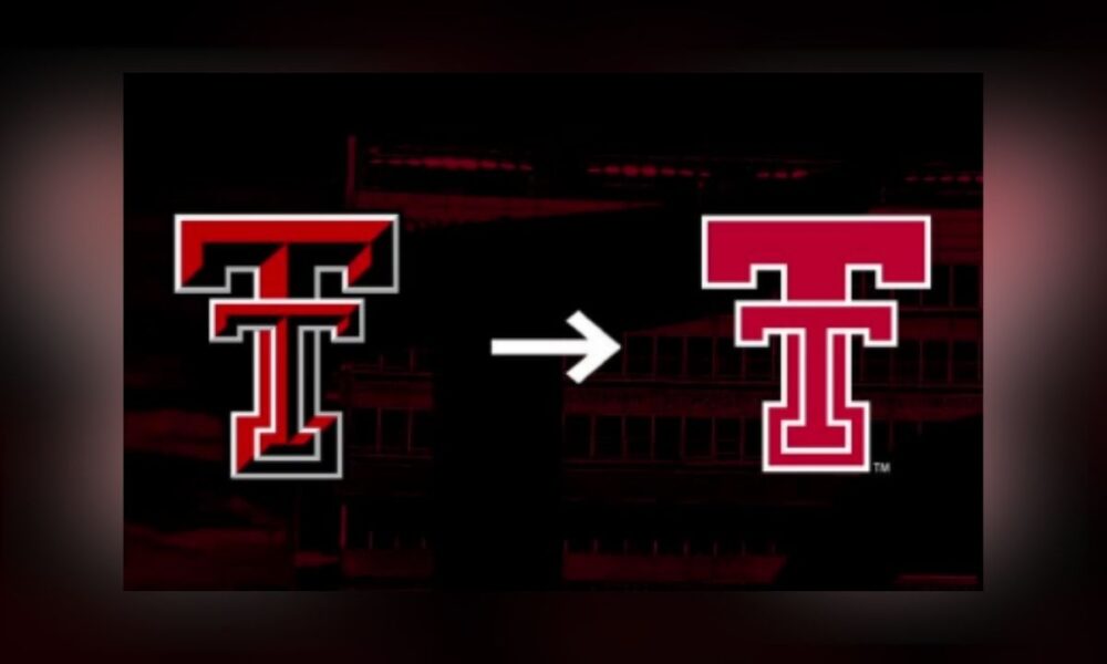
The updated Double T, featuring a clean, red-and-white design with proportional elements and new colorways, will adorn all athletic uniforms starting next academic year. It is already visible at the Dustin R. Womble Football Center’s outdoor turf practice field and the United Supermarkets Arena court.
The university plans to update all athletic facilities with the new logo by spring 2026.
“The clean, flat design of the new Double T logo combines many of the traditional aspects of Texas Tech’s primary mark with a modernized twist that features proportional design elements and updated colorways,” the athletic department said in a news release.
The rebrand, a multi-year project, follows a brand audit by Dallas-based LDWW, which surveyed donors, season ticket holders, student-athletes, coaches, and Texas Tech University System Board of Regents members in 2024.
The effort coincided with a new 10-year partnership with Adidas, which led to the logo redesign and the creation of three custom fonts — Pumpjack, Techsans, and Matador — inspired by Texas Tech’s early football teams, West Texas culture, and alumnus Patrick Mahomes II.
Rooted in our past, redefined for what's next.
Inside our new brand identity, coming in 2026. pic.twitter.com/uXSF8xOD1U
— Texas Tech Red Raiders (@TechAthletics) October 7, 2025
“As we celebrate Homecoming this weekend and welcome back thousands of alumni to campus, this is the perfect opportunity to unveil our new branding that will resonate with our history and define Texas Tech Athletics for future generations of Red Raiders,” said Director of Athletics Kirby Hocutt. “This multi-year project will propel our athletics brand further into this new era of college athletics where Texas Tech will continue to lead at a national level.”
The rebrand also includes a rearing Masked Rider logo, a tertiary mark combining the Masked Rider with the Double T, and a revised Texas outline logo. Torch Creative, a branding agency with clients in the NBA, NHL, and college athletics, designed new sport-specific Raider Red caricatures, depicting the mascot in actions, like dribbling a basketball or swinging a golf club.
However, the new logo has sparked mixed reactions among fans. Some expressed frustration on social media, calling it “plain” and “boring” or comparing it to logos from other universities like Temple.
One user remarked, “Looks like a kindergartner designed this,” while several other commenters referenced the recent Cracker Barrel logo controversy.
While the majority of comments on social media were negative, some fans embraced the change, with one writing, “The classic logo is super clean and a great look. … Texas Tech has great branding regardless so I’m happy with any Double T.”
“It’s great!” said social media user Sports Buckaroo.
“This is fantastic!” wrote X user Randall Cotton.
The new marks will be exclusive to athletics, with the beveled Double T remaining the university’s official campus logo. Adidas and Texas Tech retailers will launch an exclusive merchandise collection featuring the new logo in April 2026, with a full rollout across all licensees in May 2026.
An updated branding guide, developed with Adidas, Torch Creative, LDWW, and the Collegiate Licensing Company, will ensure consistent use across all platforms.