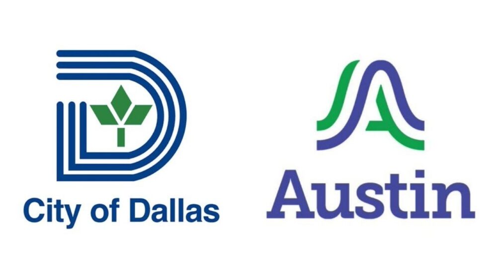
Austin has unveiled a new minimalist logo featuring a blue and green “A” symbol. It replaces the traditional red, white, and blue emblem as part of a $1.1 million rebranding effort. The goal is to unify the city’s more than 300 departmental logos. The redesign has sparked mixed reactions from residents, with critics taking to social media to voice concerns about the cost and design.
The controversy raises broader questions about municipal spending priorities and brand identity in one of America’s fastest-growing cities.
“For the first time in Austin’s history, we will have a logo to represent the city services and unify us as one organization, one Austin,” City Manager T.C. Broadnax said.
City officials describe the new brand as reflecting Austin’s values while providing a more consistent, recognizable identity across city services. The logo’s flowing lines are intended to symbolize city connections, landmarks, and the local environment.
Social media responses have been sharply critical. Residents have called the design too corporate and sterile, with some comparing it to financial institutions. Others noted the logo’s striking resemblance to Dallas’s city logo, adding fuel to the backlash.
“Austin spent $1.1m on their new logo and all the consultants did was Chat GPT the Dallas logo. Prove me wrong,” Keller Mayor Armin Mizani posted on X.
Austin spent $1.1m on their new logo and all the consultants did was Chat GPT the Dallas logo. Prove me wrong. #txlege pic.twitter.com/VawwNn9hIg
— Mayor Armin Mizani (@ArminMizaniTX) September 5, 2025
The Dallas comparison carries additional significance. Broadnax resigned as Dallas’s city manager in February 2024 before taking the Austin role later that year. He accepted his current role in Austin, where he now oversees the new branding initiative.
City officials emphasize that the brand initiative extends beyond visual design. They hope the rebrand will enhance unity and transparency in city services. Officials also say it represents growth, resilience, and inclusivity.
“We deliberately chose a mark that reminded us of movement to reflect how welcoming, flexible and resilient this community and our employees are,” Chief Communications Director Jessica King said.
The logo design features a green and blue “A” shape topped by the word “Austin.” City officials report the colors symbolize the city’s hills and “violet crown skies.” They say it draws inspiration from local geography to resonate with residents and employees.
Despite these explanations, the $1.1 million price tag continues to draw scrutiny. Residents remain concerned about public spending priorities. Many critics view the change as unnecessary and too similar to Dallas’s branding.


